Light brings the little things forward.
A soft curve. A translucent edge. The gentle reflection of a silver pouch. These details give the collection its character before the first application begins.
Our visual world follows the same idea as the ritual: care can feel precise and welcoming at the same time. Warm light and open space let the product do the talking.
The packaging, brought to life.
The studio images on this site turn our draft artwork into realistic product visualizations. They show the intended feel of the sachet: silver material, a cream label, and the familiar Optimal Beauty wordmark.
They are a preview of the design direction, rather than photographs of final production stock. As we move toward launch, finished packaging and product details may change.
Explore the collection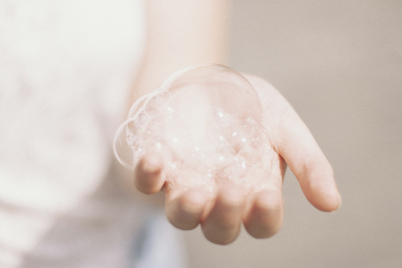
A clear place for every detail.
The front introduces the patch. The directions help you use it. The batch reference helps us answer a question about the item in your hand. Each part has a job.
We want the important information to be as easy to find as the product name. That is why our care guide keeps preparation, timing, and storage together in plain language.
Open the care guideBeauty with its feet on the ground.
Beautiful visuals can introduce a feeling. Product documentation gives you the details behind it. We make room for both.
Material close-ups are illustrative, not microscopic measurements or results. When the collection is ready, its finished directions and quality information will be part of the experience too.
Our quality commitment